Outdoor lighting not only illuminates but also sets the perfect ambiance for our outdoor spaces. As the sun sets and darkness graces us, the choice of outdoor light color can define and set the atmosphere we desire. In this article, we explore outdoor light color and how it can best be used to enhance our outdoor spaces from cozy cobble pathways in an English garden to moonlighting from trees.
Color is an inherent characteristic of visible lights. It affects the atmosphere of any space, adding interest and dramatic effect.
Understanding the three primary attributes of color – hue, saturation, and value – allows us to specify the right fixture to illuminate outdoor features. Hue represents the color itself within the visual spectrum such as red, orange, yellow, green, and blue.
Saturation is the richness or softness of the light from a source. It ranges in scale from 0 to 100; a higher saturation value indicates a more vibrant color while a low saturation appears muted. Value describes the intensity of the color (lightness or darkness) with a higher value appearing brighter. The value is represented by a value between 0 and 100.
With LED light sources, colors are created by combining different intensities of the three primary colors: red, green, and blue a wide range of hues can be achieved. The color created can then be altered by changing the saturation and the intensity of the color.
With LED, we are able to control these attributes much more precisely offering boundless possibilities in our lighting design. By combining the three primary color LED chips- red, green, and blue (RGB)- we can tailor the color to achieve the desired effect and produce an array of captivating colors. Additionally, the addition of white into the RGB model forms the RGBW model. The extra white chip allows a user to intensify or soften the light color to complement the RGB colors. By varying the intensity of white along with red, green, and blue, softer colors can be achieved.
Optics and color filters can further be utilized to expand our realm of possibilities.
We use two scales to describe the color characteristics of light:
- Color temperature: Describes the warmness or coolness of light.
- Color rendering index: Describes how accurately a light source renders the colors on a certain material or element.
Color Temperature:
As mentioned earlier, color temperature is a characteristic that defines the warmness or coolness of light emitted by a source. It is measured in Kelvin units, ranging from 1000 to 10,000 kelvins. However, it’s important to note that color temperature does not directly measure the color of light itself.
Instead, color temperature is a comparison of the colors emitted by a light source to the ideal black body radiation. A black body radiator is an object that, when heated by passing a current through it, emits heat and light solely due to its high temperature. An excellent example of this is the traditional incandescent light bulb. As the filament within an incandescent bulb heats up, it starts emitting red light, which then transitions through shades of orange, yellow, white, and eventually blue-white as the temperature increases. The Kelvin temperature is matched to the specific color of light being emitted at that particular temperature, thus serving as a descriptor of the light’s color. When professionals discuss color temperature, they are essentially referring to the color emitted by the black body radiator at a given temperature.
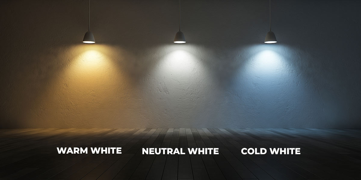
In the realm of lighting, the Kelvin temperature scale helps us categorize the color of light. Higher Kelvin temperatures, typically ranging from 3,600K to 5,500K, are considered cool, while lower color temperatures, around 2,700K to 3,000K, are considered warm. Incandescent and halogen lamps fall within the warm range, with halogen lamps being slightly cooler. White light typically falls between 3,500K and 4,500 K. Color temperatures above 3,500K are classified as cooler temperatures, exhibiting blue tones similar to a clear midday sun, whereas temperatures at 3,000K and below are considered warmer, displaying a more amber tone.
The color temperature scale ranges from warm colors such as red, orange, and yellow to cooler colors like white, blue white, and deep blue. Surprisingly, cooler colors are associated with higher color temperatures, while warmer colors have lower Kelvin temperatures. However, it’s essential to note that in this context, “cool” refers to the appearance of the light and not the temperature of the light emitter itself. Warmer colors have lower Kelvin temperatures, whereas cooler lights have higher color temperatures.
When it comes to LED and other light sources like fluorescents that do not produce heat in the same way as incandescent lights, the color of light emitted is a result of altering the chemical composition of the LED chips. LED lights emit light when current passes through a chip, releasing photons as a result of this process. For these light sources, we use Correlated Color Temperature (CCT) to describe the color temperature of the light emitted. Lower CCT values, around 2,400K, represent warm colors, while higher values, around 10,000K, indicate cooler or bluish light.
To determine the color of light emitted by an LED, it is compared to a known color temperature of a heated black body emitter. This helps us understand and categorize the color appearance of different light sources.
What Color temperature to use
Color temperature plays a pivotal role in outdoor lighting, as it directly impacts the ambiance and visual appeal of the illuminated space. Individual preferences and the specific features being highlighted contribute to the selection of color temperature in a landscape.
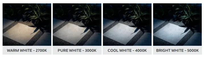
In residential outdoor lighting, the primary Kelvin range typically falls between 2500K and 4000K. Matching the color temperature to the surroundings creates visual harmony and a comfortable atmosphere. LED light fixtures offer a wide range of color temperature values, from warm white to pure white and blue white, providing versatility in enhancing the home’s exterior and garden elements.
Different color temperatures evoke varied responses in our brains, making it essential to choose the right temperature to enhance specific landscape elements and avoid unnatural appearances. For instance, slightly cool white light can create an elegant moonlighting effect when illuminating a tree.
Warmer lights are ideal for highlighting brown, red, orange, or yellow foliage, creating an inviting and relaxed atmosphere. Neutral or soft colors complement natural-colored walls or stonework, while warm and soft lights are perfect for gathering spaces.
White lights suit dark materials like slate, black, or gray, as well as evergreen trees and shrubs, offering a moonlit effect when mounted on the canopy of mature trees. They are also used for illuminating warning signs and signage due to their distinguishable nature under bright white light. Blue-white light works wonders in highlighting blue or purple foliage, making plant material appear lush and vibrant.
In lighting scenes that illuminate both plants and architectural elements, the slight color shift between the two adds depth, creating contrast and separation for a captivating and dramatic effect.
Various color temperature ranges serve different purposes:
- 2000K-3000K: Cozy warm to warm white light, creating a calming and intimate atmosphere while offering functional light for tasks and navigation. Suitable for highlighting outdoor features such as gardens, statues, and stonework.
- 3100K-4500K: Cool white lights, bright and vibrant, perfect for environments with cool colors like blue, green, or white, as well as grey neutrals and stainless materials.
- 4600-6500K: Mimics natural daylight/moonlight, offering crisp and clear lighting, highlighting details and focal points. Used in security lighting and showcasing water features.
Color filters provide flexibility in design, allowing for fine-tuning of color temperature within a single fixture. Filters like amber, blue, green, and clear can produce distinct effects, creating a warm, cool, or natural ambiance.
Most properties should limit the use of color. The addition of a color filter also decreases light output. Generally, yellow filters transmit only 50% and blue can decrease the output by as much as 88%. The use of color filters requires increasing the lamp wattage or adding more fixtures to create the desired effect.
Color Rendering index
Color Rendering Index (CRI) serves as a crucial indicator of a light fixture’s ability to accurately illuminate colors. Ranging from 0 to 100, the CRI scale signifies how faithfully the light source can reproduce colors based on the quality of light it emits.
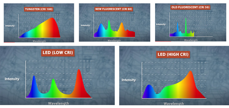
Each beam of light consists of various colors, including red, orange, yellow, green, blue, indigo, and violet. A high CRI indicates that the light produced contains a rich blend of all colors within the visible spectrum, allowing for accurate color reproduction when reflected off objects. A CRI ranging from 80 to 100 ensures remarkable fidelity across the entire range of hues, presenting an item being illuminated with precise and true-to-life color representations.
It’s essential to distinguish CRI from CCT (Correlated Color Temperature), as they represent different aspects of light quality. CRI values are used to assess a lamp’s color rendering ability by comparing it against a reference source with a CRI of 100. This evaluation involves testing the light source against eight standard pastel colors, with the difference in light reflected providing the numeric CRI value.
Sunlight, incandescent, and halogen lights boasted a perfect CRI of 100, while basic fluorescent lights exhibited lower CRI values and sometimes cast a green or magenta hue due to sharp color spikes. LED lights often exhibit variations in this spectrum, leading to sharp spikes and falls in different color regions.
However, improvements have led to the introduction of fluorescent fixtures with a CRI of 80 and higher, as well as enhancements in LED CRI ratings, enabling more accurate color rendering.
Though the CRI rating is valuable in assessing overall light quality, it has certain limitations. Nevertheless, when color distinction is of utmost importance, opting for light sources with a CRI of 80 and higher ensures exceptional color rendering, elevating the visual appeal of the illuminated environment, particularly in landscape lighting, where a CRI of 70 is considered good, and anything above 80 is deemed phenomenal.
Different lighting applications call for varying CRI requirements. Landscape lighting, for instance, benefits from a CRI of 80 or higher to emphasize the colors of flowers or plants, while lower CRI lamps can be suitable for the general illumination of walkways and paths. Personal preferences also play a significant role in selecting the appropriate CRI for each lighting application.
To Sum Up
Selecting outdoor light colors holds immense significance in shaping the ambiance and functionality of your space. Drawing inspiration from the natural illumination of the sun during the day or the moon at night can guide your choices. Opt for light sources that enhance the features you wish to illuminate and align with the desired lighting effect.
Maintaining cohesion and balance in the lighting scene is essential. Consider using fixtures with similar color temperatures, and reserving fun colors and vibrant effects for special events or holidays when needed. When using different light sources with distinct appearances, spacing them farther apart in the space can minimize the perception of color difference.
Hues in color rendering become more noticeable when illuminating common references, such as architectural facades or plantings of the same species and color. To achieve optimal results in your nightscape, especially if new to landscape lighting, consulting with a certified landscape lighting contractor is advisable. Some may offer free consultations, assess your space based on photos and references, or carry out the project as agreed upon in the quote. This expertise ensures a well-executed and visually appealing lighting design for your outdoor space.
